To be honest, I often base my grocery store purchases on pretty packaging over price. Well… as much as my budget will allow. There is something about clean typography, bold PMS colors and the lack of gradients and dropshadows that makes me say, “Yes, please!” But why is it that we often make decisions based on what wrappers, boxes and bottles look like?
One assumption: it’s part of our human DNA to gravitate towards beauty. Nothing is exempt from this, even when it comes to what we consume. Another assumption: beauty equals quality.
An industry that embraces both theories is the world of craft beer and liquor. Elaborate 3D bottles and highly illustrative cans inform the consumer that the contents inside are just as much a piece of art as the container’s colorful exterior. Here are a few brands we think deserve an A+ for pumping out visually appealing beverages, and flavorful ones to boot.
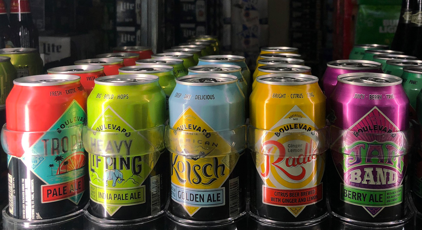
A local favorite, Boulevard Brewing Company in Kansas City, MO, takes their craft seriously, both inside and outside the bottle. Their illustrative cans and labeling can be found throughout the Midwest and in a slew of other states, and they’ve even made their way into Kauffman Stadium as one of the official beers of the Royals. They house their own talented team of designers to create colorful concepts for each brew they produce, and we’ve yet to see a design that hasn’t impressed us. Let’s just say we are big fans of this hometown beer brand!
Another brewery that is revolutionizing the look of the craft beer industry is 21st Amendment Brewery in San Francisco, CA. Similar to Boulevard, their brews have popped up at AT&T Park (home of the Giants), and their splashy artwork makes many San Franciscans feel even more hip when they hold the creative cans. For instance, their Watermelon Sour Ale can depicts a roller skating Lady Liberty decked out in star-shaped shades and retro Americana colors. Epic to say the least.
Craft distilleries are also perfecting their products and packaging with exquisite bottles and labels. Tom’s Town Distilling Company, another local favorite of ours, is doing just that. Their embossed metallic labels pack a punch in liquor store aisles, and they have the taste to back it up. Their Eli’s Strongarm Vodka was named Best Craft Vodka Distillery in USA Today’s 2017 Readers’ Choice Awards. Smooth going down, and easy on the eye? Perfect combo.
So how does this fancy artwork fit into a company’s overall brand? Well, there are many folks getting it right. They understand that communicating the same visual message from their tap handles to their 6-pack caddies helps establish brand recognition in a sea of competitors. They also understand that differentiating their vodka from 17 others on the top shelf requires some kick-butt design. Pushing the envelope creatively and investing more financially in packaging are essential to help them stand out in the growing population of alcohol competitors. A solid website and other brand touch points that display their products’ museum-quality artwork are also important, and for many of these guys, brand cohesion is really paying off. (Seriously though – craft beer YTD stocks are up, but stocks for the big boys like Coors and Anhueser-Busch… not so much.)
When it comes to packaging, one thing’s for sure: beauty matters. And it’s the smaller guys, the craft brewers and distillers, who are raising the creative bar (pun intended). Their riskier creative has made a ripple in a world where the only choices were once the red or blue can. These recyclable pieces of art lining store shelves across the globe have made a once sterile industry more eye-catching, and are challenging other food and beverage brands to invest more in design. Visually gripping the customer matters, and from what we’ve seen, the sales will follow. Way to go, craft brewers. Keep making cool stuff.
Need help with killer creative or branding? It’s never last call around here! Drop us a line at holler@bonfire5.com. Cheers!